M.
CRM
We created a tool for a marketing team to be constantly connected. They need to manage all tasks and be updated on the status of negotiations.
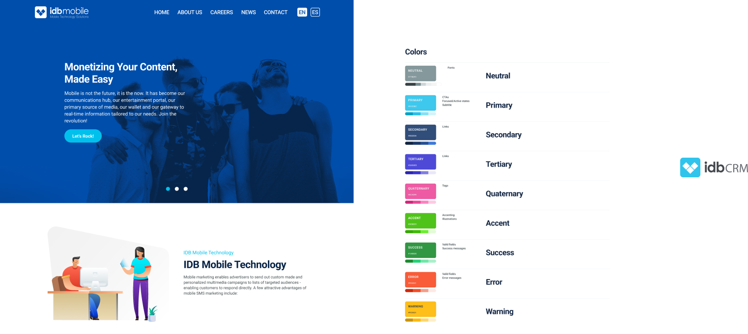
The blue color represents loyalty, intuition and sensitivity to interpret the data. The logo represents innovation and technological advancement, aligning with the company's brand.
In several meetings with the stakeholders, they explained the problematic of the marketing department. They were a group of more than 8 people working from home sometimes, so they had the need to be connected and updated in real time.
The necessity of a CRM to consult the data was clear.
Users
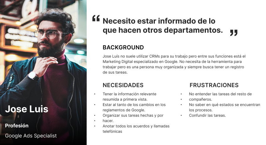
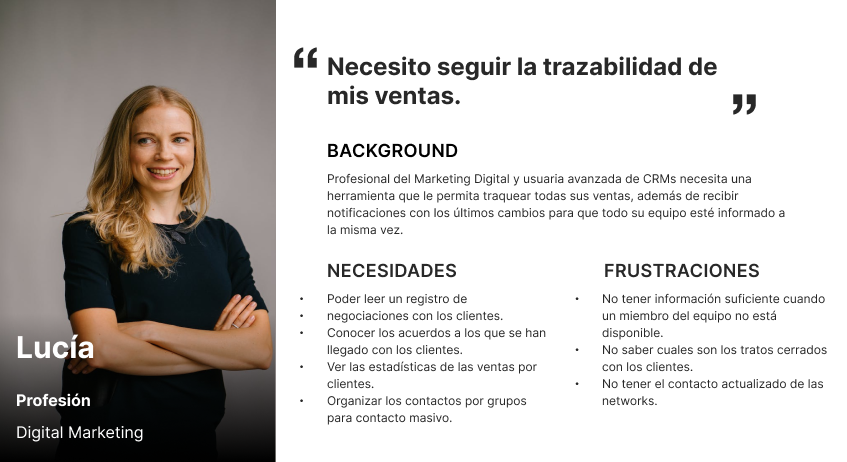
In order to empathize with the different types of users wo had different job positions and tasks inside the company, we developed so-called proto-personas, which are based on the interviews we carried out.
These serve as a starting point to reflect on the needs and challenges of the user and possible solutions that can be considered later in building the information architecture.
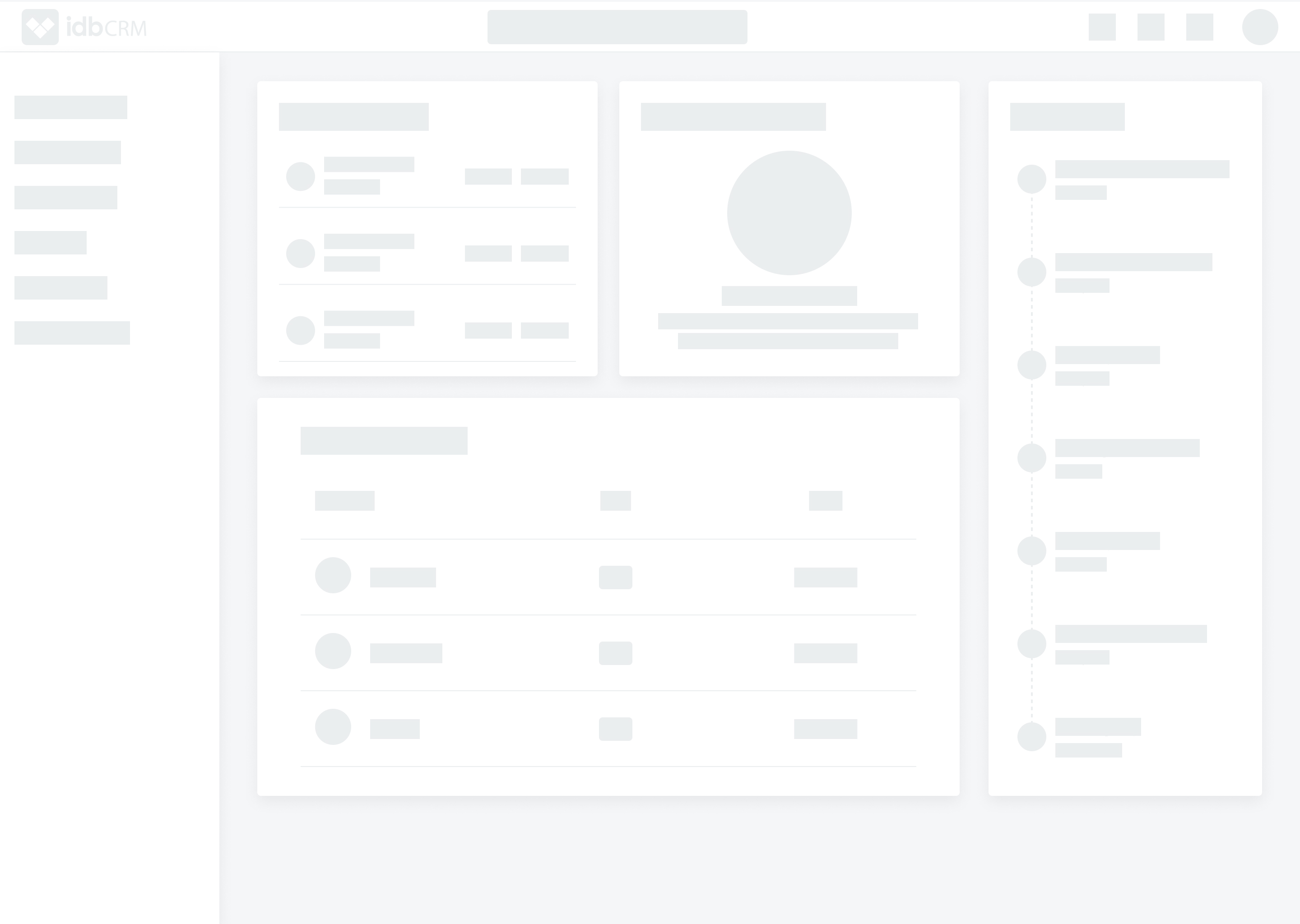
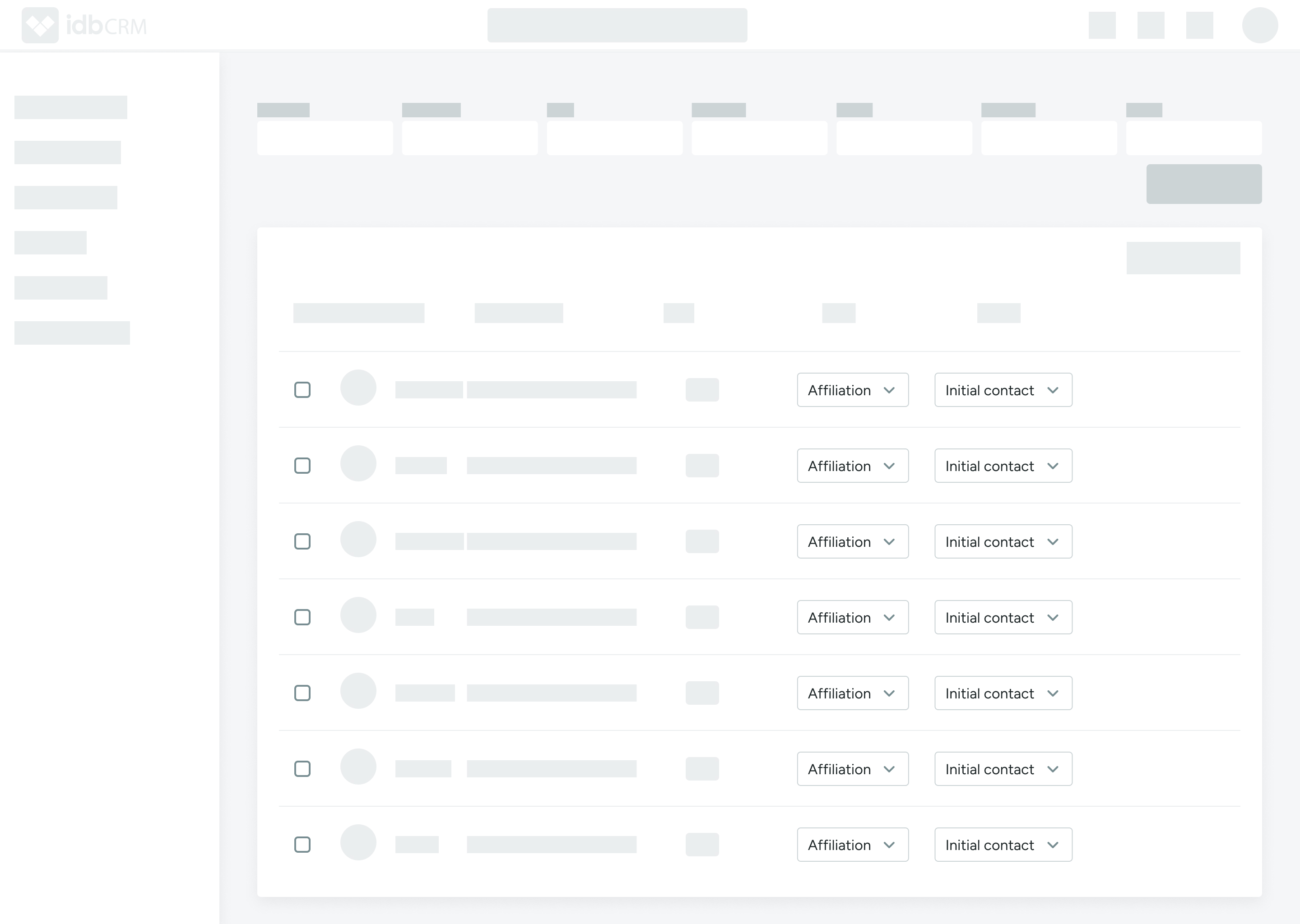
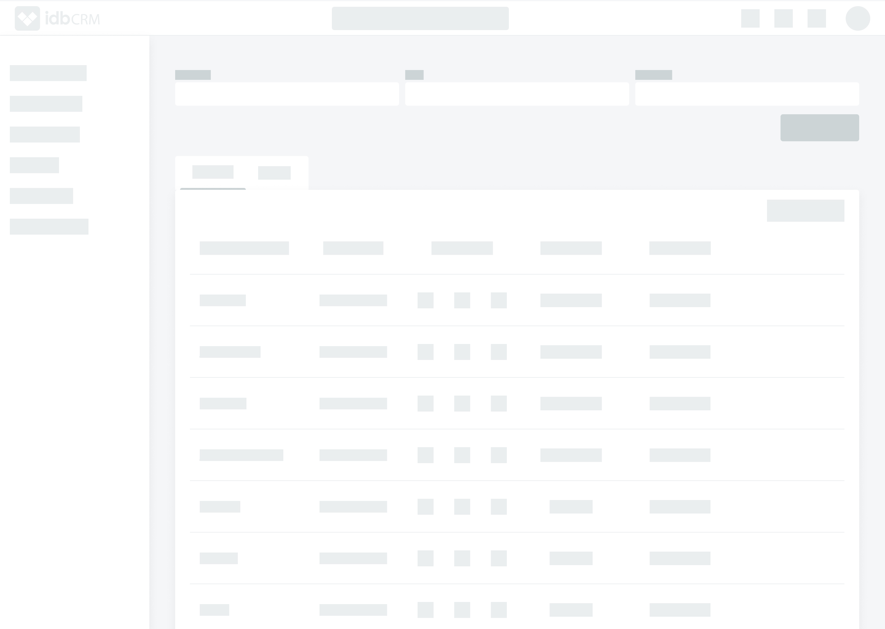
Wireframes
Visual Style
It was a tool for a company with their own visual identity, so the CRM had to fix into the values of the brand. The blue color represents loyalty, intuition and sensitivity to interpret the data. The logo represents innovation and technological advancement, aligning with the company's brand.
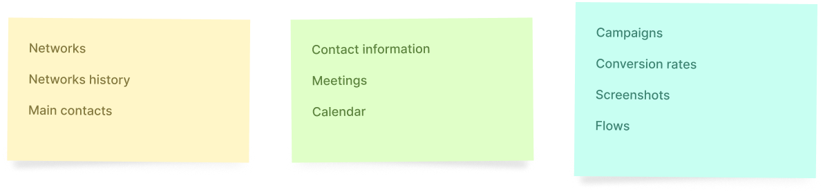
Information arquitecture
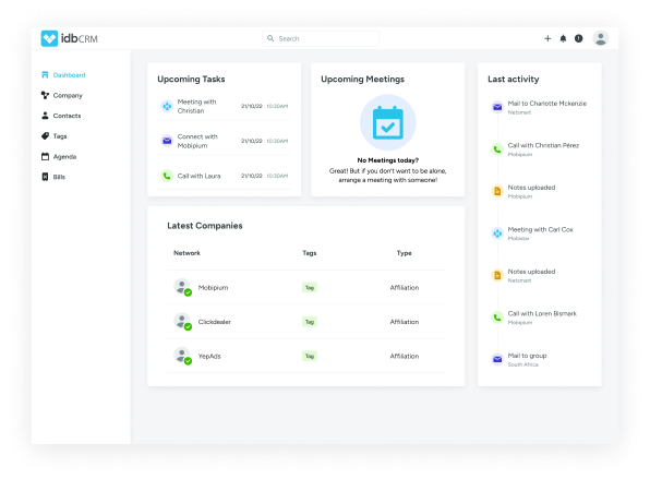
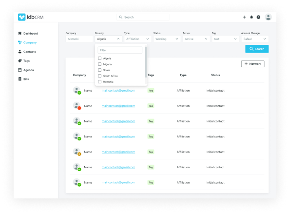
Based on the interviews with the users, we understood the structure to present the information in a clear way. There are three big groups in the structure: networks, contacts and the campaigns. We jointly decided what to keep, what to kick and how integrate the data in an intuitive architecture.
The solution
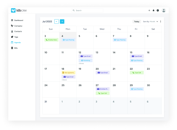
All the insights and conclusions were analized and finally it lead us to the final screens!