M.
MoMA App: A Journey Begins
The Story Starts in 2029: A New Chapter for MoMA Imagine it’s 2029, and the Museum of Modern Art (MoMA) is not only celebrating its centennial but also unveiling a groundbreaking new museum dedicated to women artists throughout history. This milestone called for a fresh digital experience—a new app to shine a light on these often-underrated talents and bring their stories to life for a global audience.
The Challenge: Crafting an Inclusive Art Experience As MoMA prepared to open its doors to this new era, the vision extended beyond showcasing women artists. The goal was to ignite a passion for art and culture among everyone—adults, children, and even those unfamiliar with museums. This required designing a wholly new experience, one that would break barriers and invite users into a world of creativity through an innovative app.
Meeting the Audience
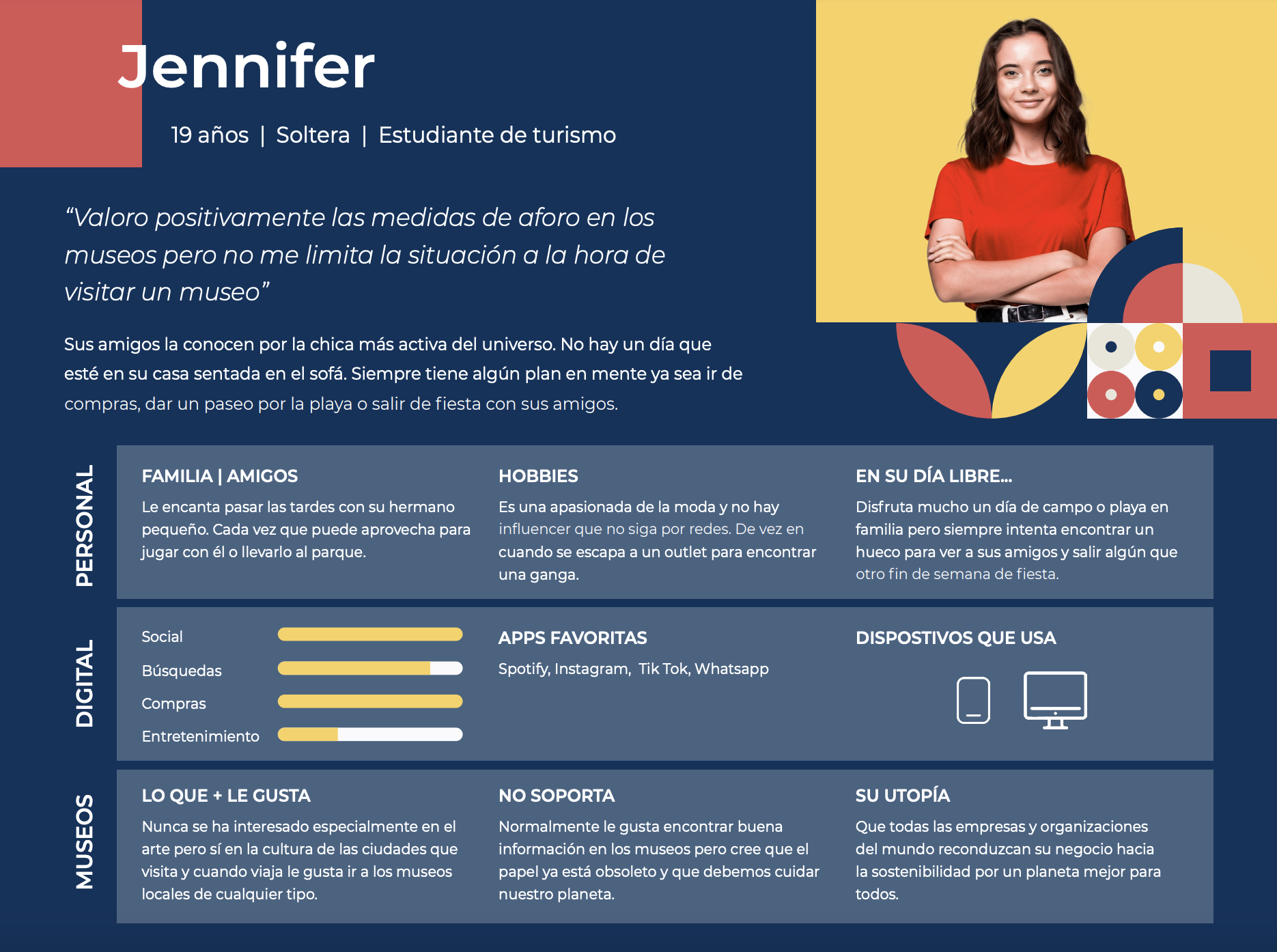
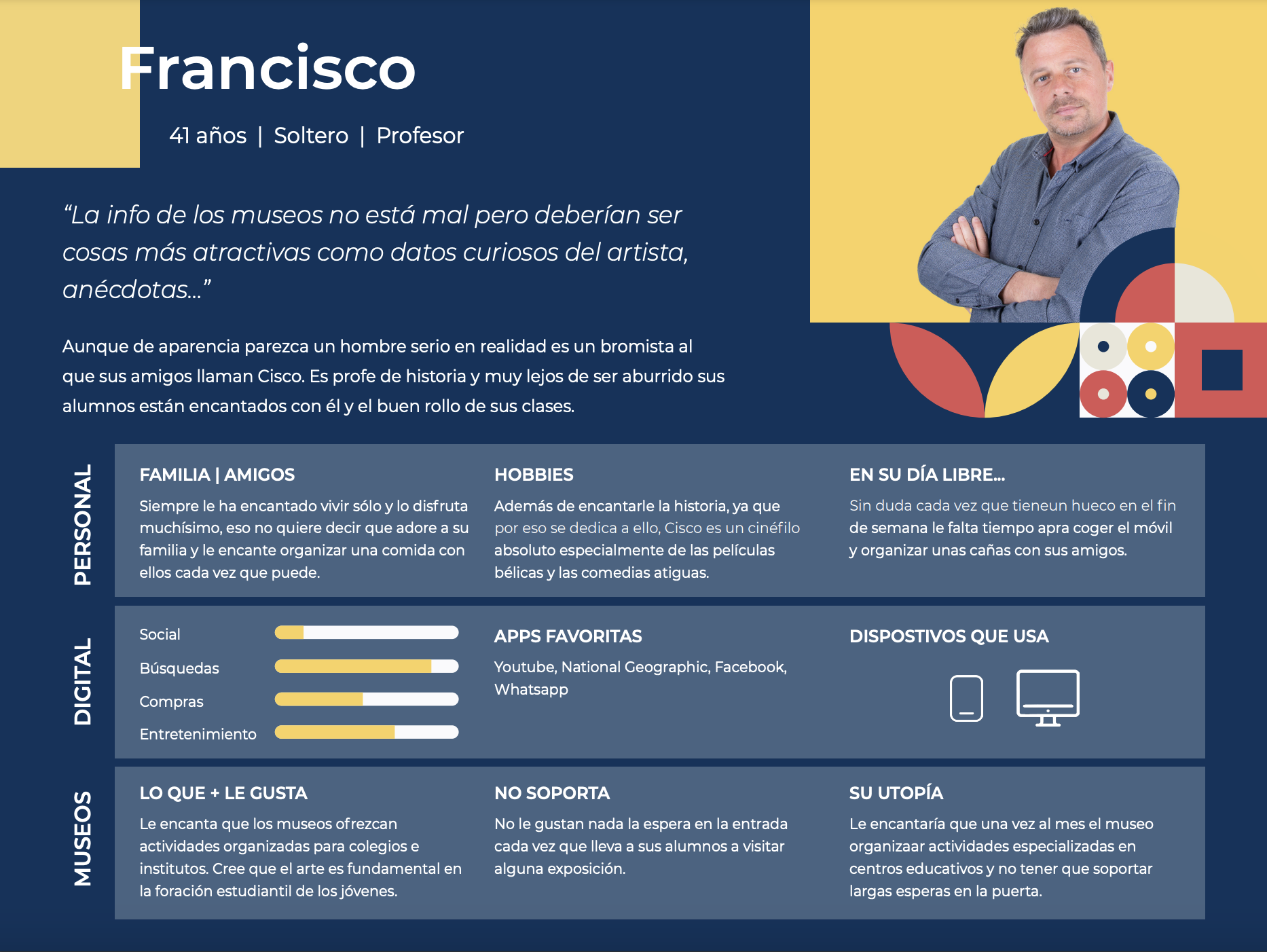
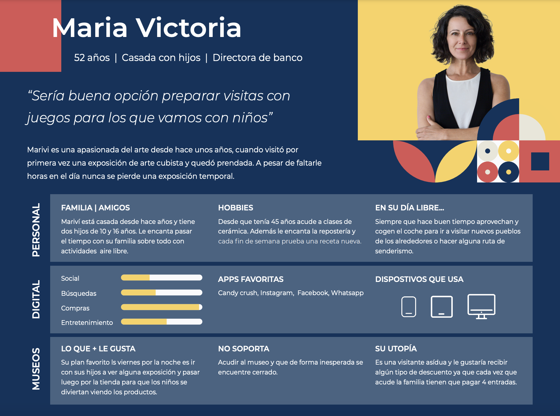
Understanding Who We’re Designing For Our journey began with uncovering the people behind the app. We found that the primary museum visitors fall between 25 and 35 years old, with most holding higher education degrees. Intriguingly, nearly 70% of respondents were women, compared to 30% men, suggesting a focus on empowering women’s narratives in the exhibitions and content. With 40% favoring Instagram and 55.1% buying tickets at the box office (versus 42.1% online), we knew we needed a digital experience that felt personal yet accessible. Here, we crafted personas to guide our design decisions.
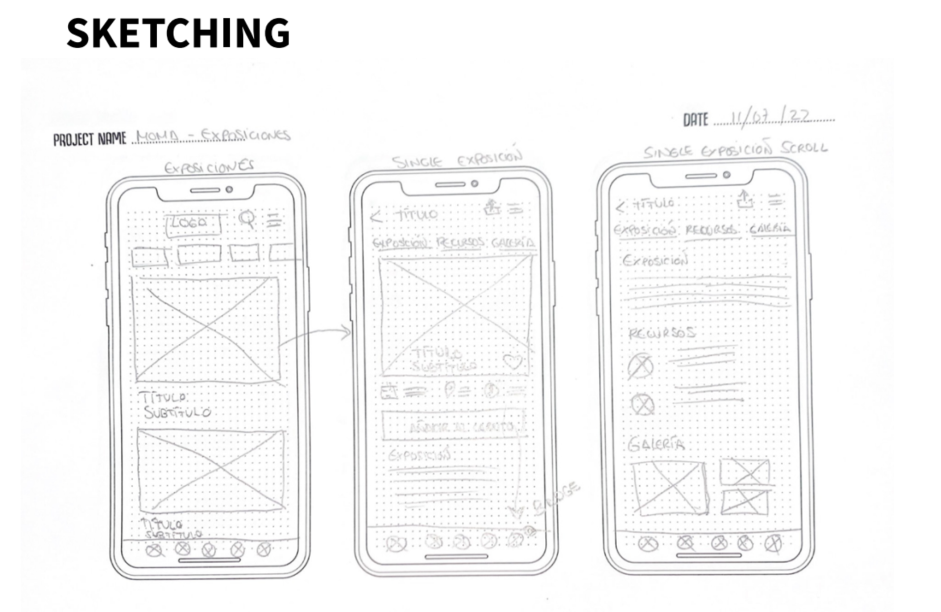
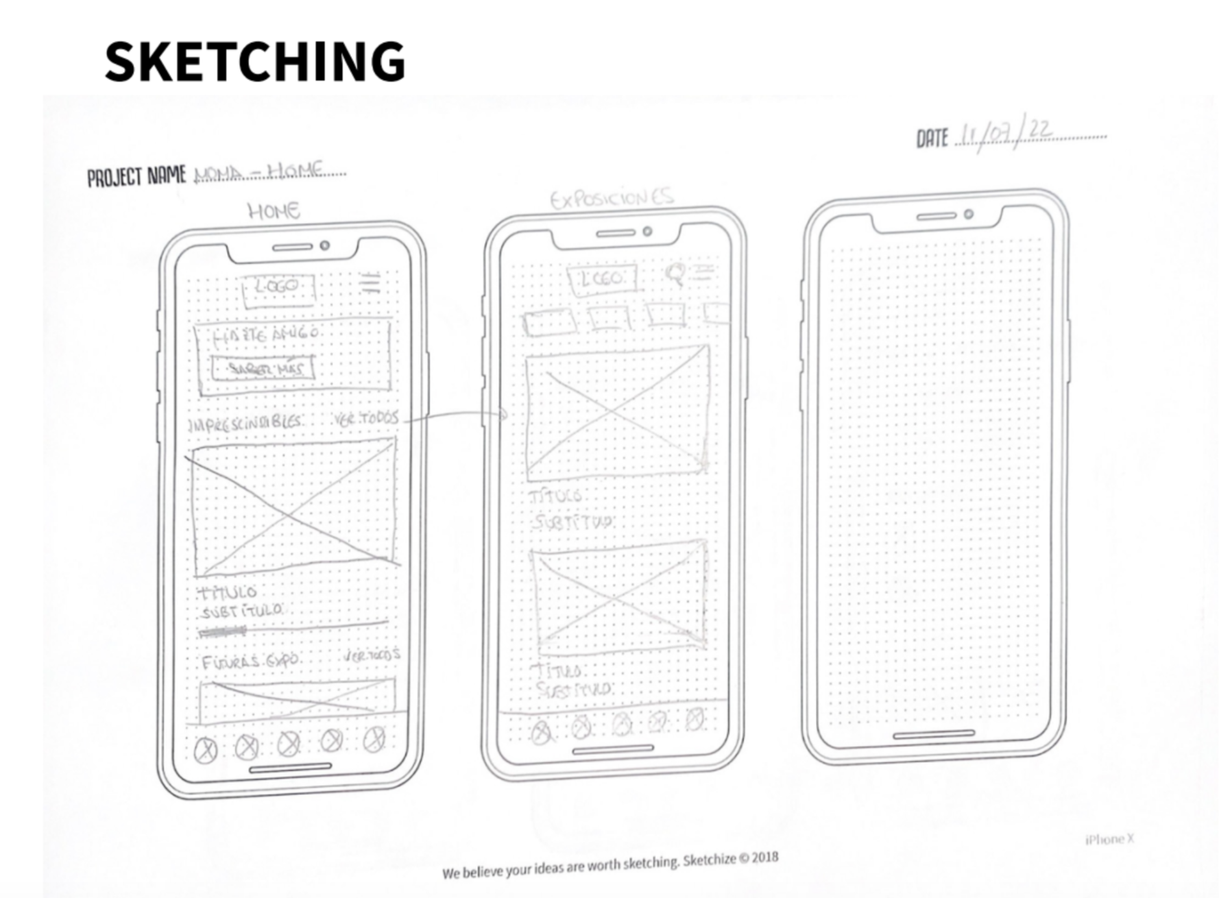
Sketching
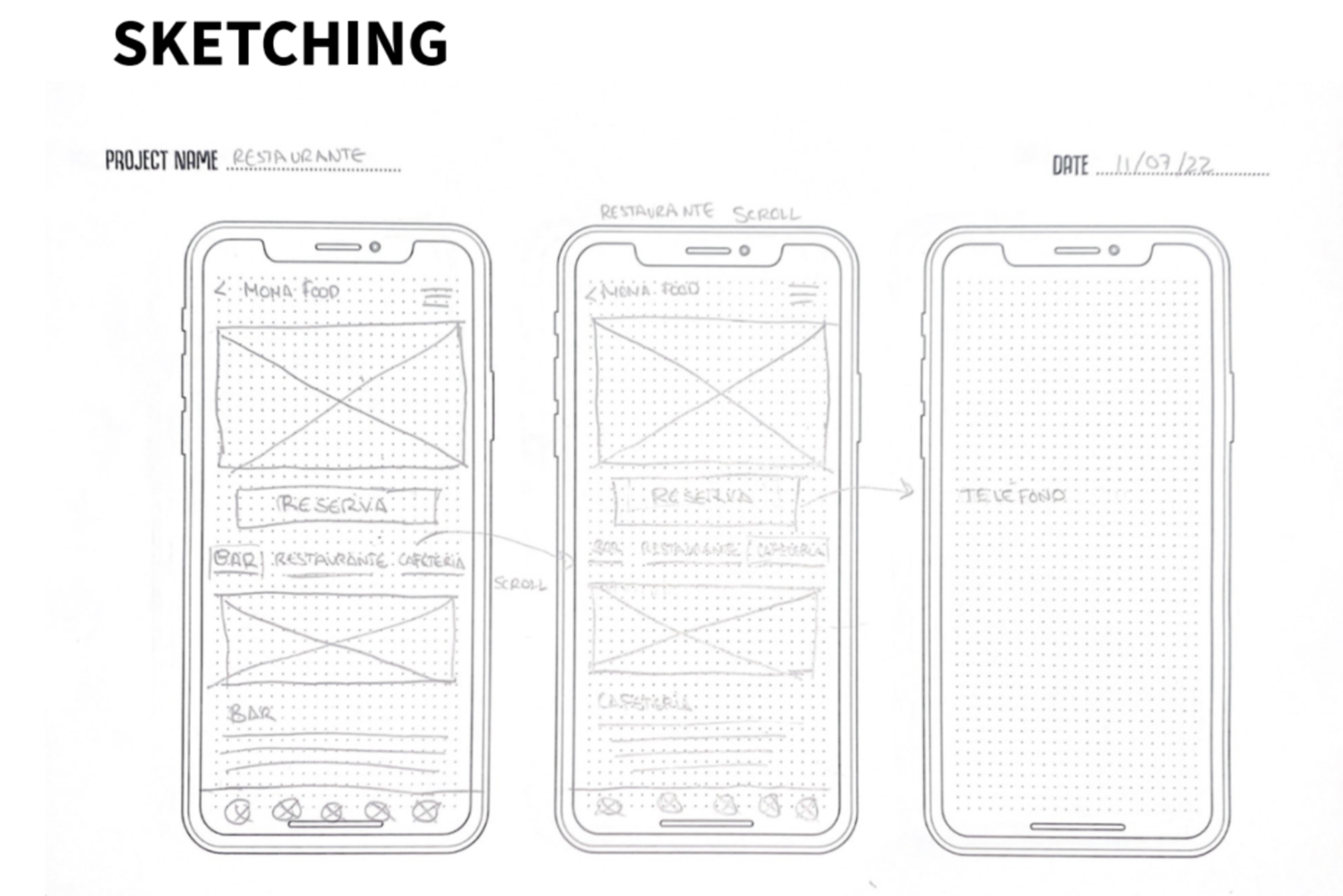
Building the Blueprint with Wireframes With our users in mind, we embarked on sketching the app’s foundation. Wireframes became our first draft, laying out the structure and flow. We explored different layouts, testing how to present artist profiles, exhibitions, and interactive features, ensuring the navigation felt intuitive from the start.
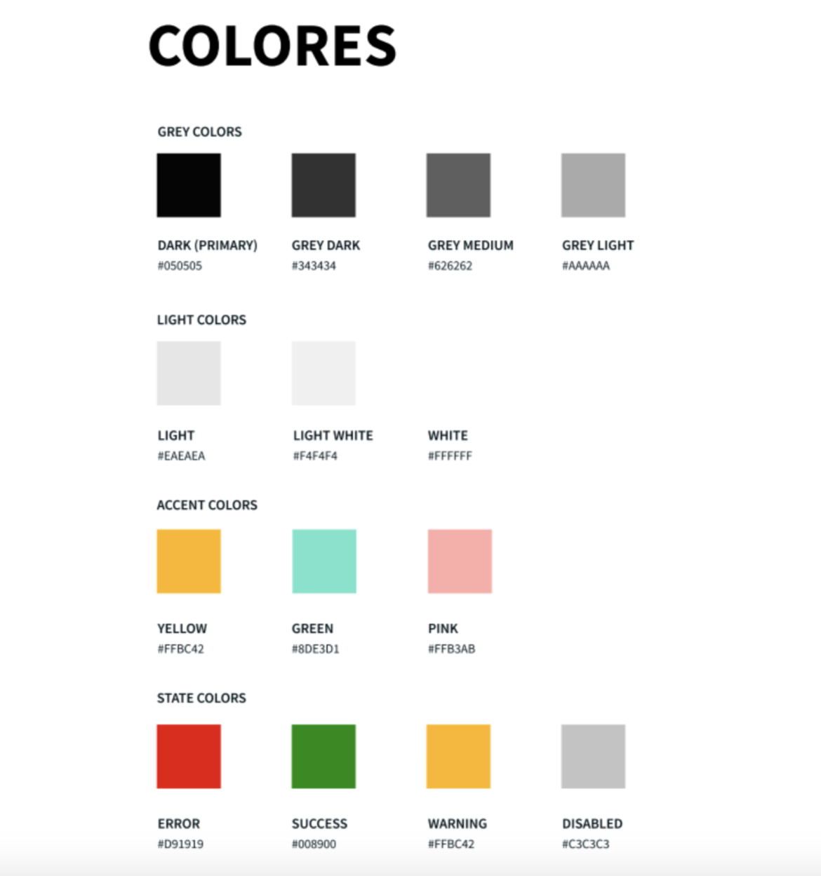
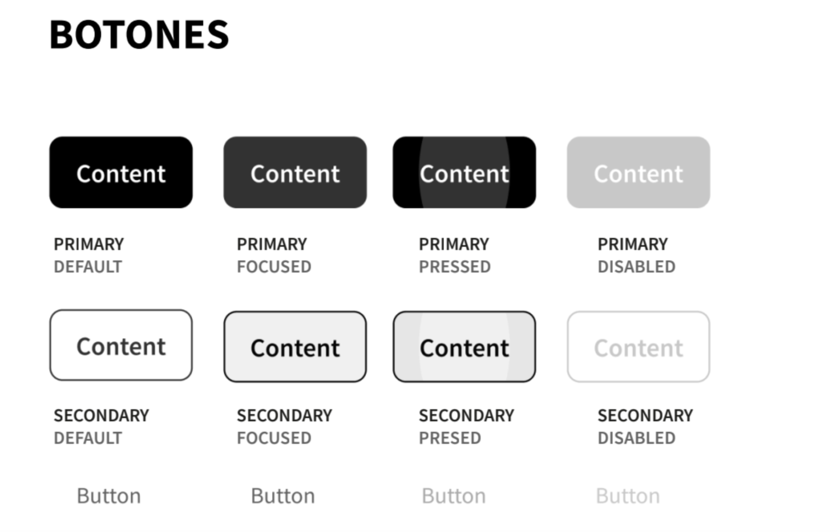
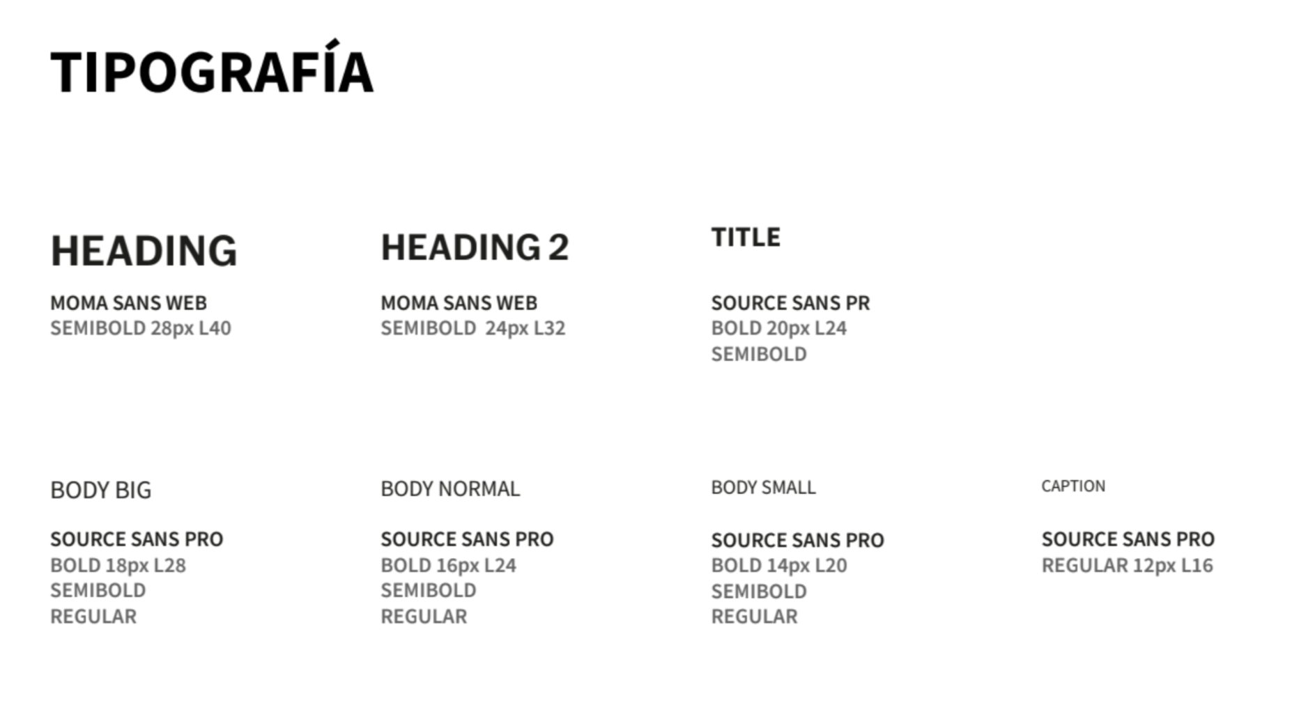
Crafting the Visual Identity
Bringing Elegance to Life Next, we dove into the visual style, honoring MoMA’s iconic black-and-white elegance while introducing subtle accent colors to add vibrancy. This design reflects creativity and inspiration, using modern typography to symbolize innovation. We carefully selected a palette, components, and typefaces to ensure the app felt both timeless and forward-thinking.
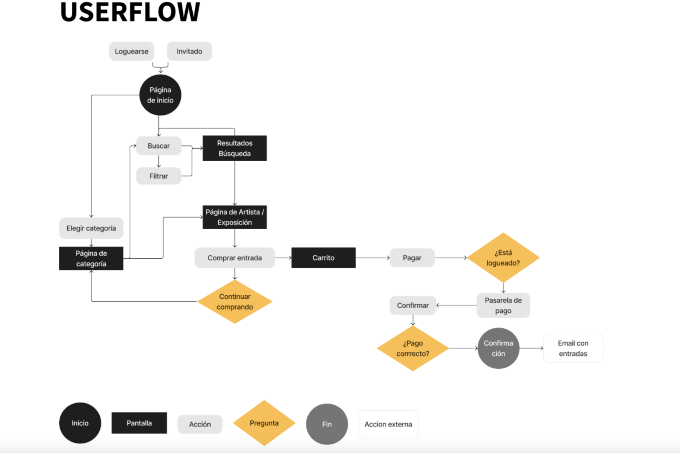
Step 4: Mapping the Journey
Designing the User Flow Armed with user insights from interviews, we mapped out a clear structure to present information. We identified three key areas— networks, contacts, and campaigns—and worked collaboratively to decide what to keep, what to refine, and how to weave the data into an intuitive architecture. This flow became the backbone of the app, guiding users effortlessly through their experience.
Unveiling the Solution
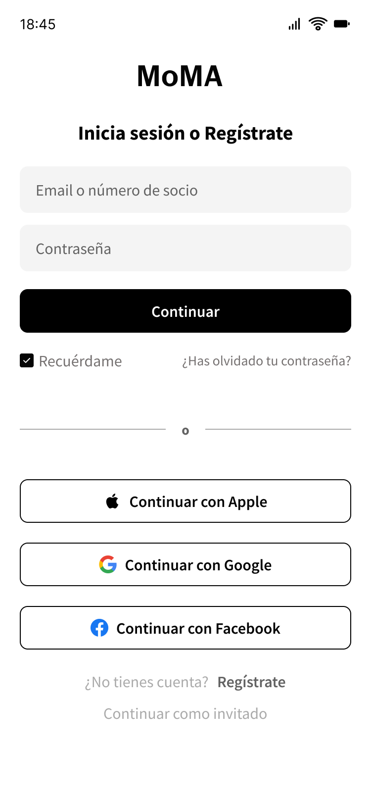
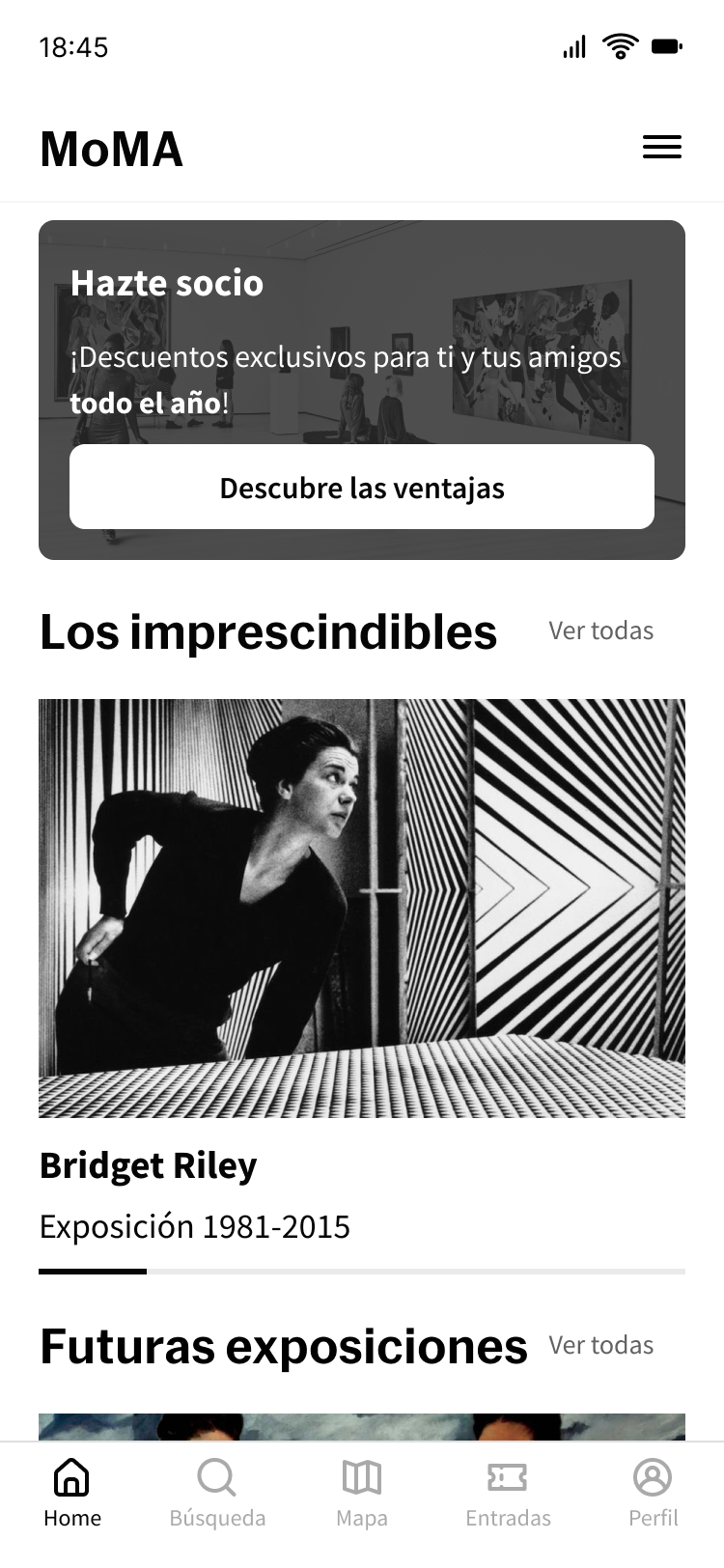
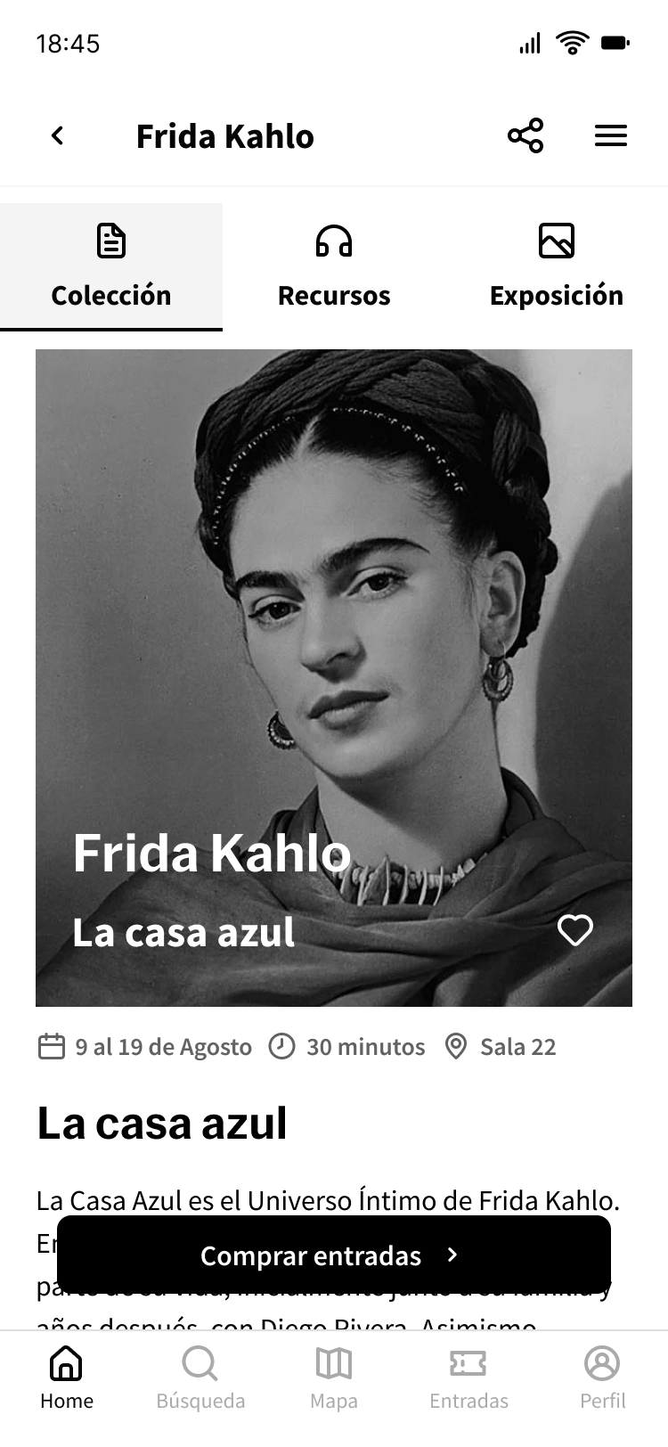
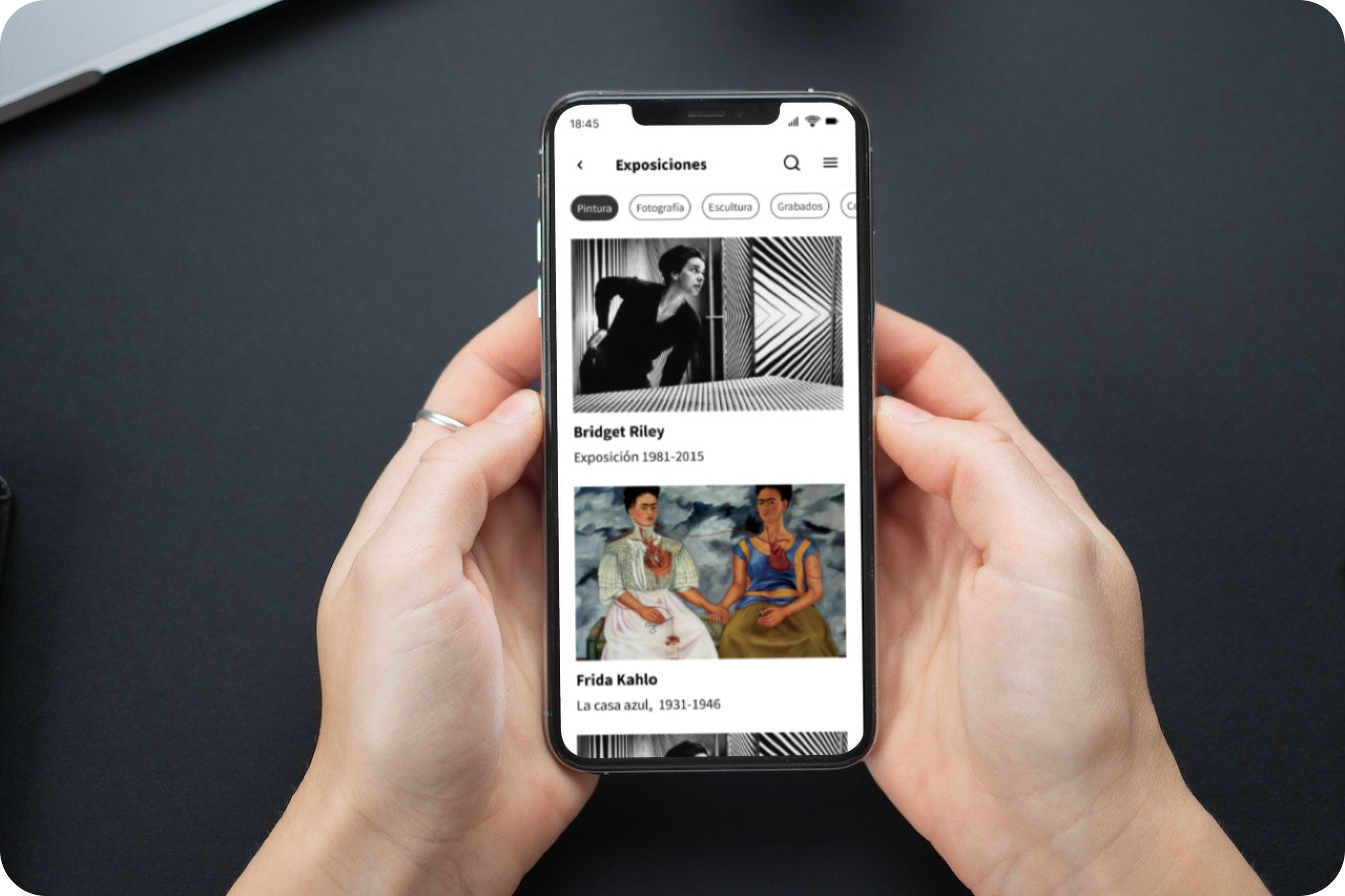
The Final Canvas Takes Shape After analyzing all insights and conclusions, we brought our vision to life with the final screens. These designs blend functionality with beauty, offering interactive features that cater to kids, adults, and first-time visitors alike, ensuring everyone can explore and enjoy the world of women artists.